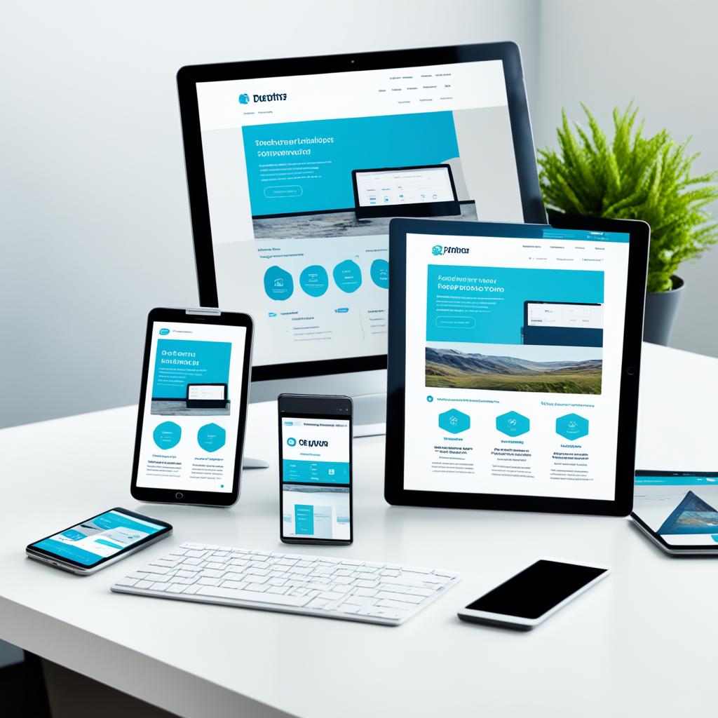
Imagine using your favorite website and seeing everything just right on your screen. This happens whether you’re using a desktop, a tablet, or a smartphone. This magic is due to responsive web design basics. It makes sure every visit to a website looks great and is easy to use, no matter the gadget. Responsive design is essential for creating a mobile-friendly website.
When you switch between devices, you’ll see how smoothly a website’s layout changes. This smooth change is called cross-platform compatibility. It ensures your online experience is the same across devices. The secret is fluid website design. Like water fitting into a container, layouts adjust to your screen size. Starting to learn about responsive design opens up new ways of seeing and using the web.
The Rise of Mobile Browsing and the Need for Responsive Design
The digital world is changing fast, and so is how we use the internet. More people than ever are browsing on smartphones. It’s vital for success in the online world to adapt to this major change.
Global Trends in Mobile Usage
Recent reports by Statista confirm a massive increase in mobile internet use worldwide. This proves that making websites mobile-friendly isn’t just nice, it’s necessary. They must fit the needs of mobile users perfectly.

How Responsive Design Addresses Mobile Users
Pew Research shows more people only use the internet on mobile devices. Websites must work well on mobile. This means they should look and function great on all devices, from phones to desktops.
NN/g’s studies support this. They show that websites need to work well on different devices for users to be happy. Responsive design is key to a great user experience.
Responsive design is more than a current trend. It’s about making websites that meet the needs of a mobile-first world. As more people use mobiles, making your site ready for all devices is crucial. It’s essential for connecting with today’s users.
Defining Responsive Web Design
Responsive web design is more than a trend; it’s crucial for sites to work well on all devices. This design approach focuses on the user’s needs, aiming to provide easy access and fluid browsing. It’s key for websites wanting to keep up with modern browsing habits.
Core Principles of Responsive Design
Responsive web design is built on specific principles like adaptive layouts and flexible images. Using fluid grids, elements adjust to the screen size. This keeps the layout consistent across devices. Flexible images also play a big role. They adjust within the fluid grid, keeping visuals sharp and loading times quick.

Responsive vs Adaptive Design
Responsive and adaptive designs both aim to improve browsing on different devices. However, they do this in different ways. Responsive design changes smoothly to fit any screen size. In contrast, adaptive design uses fixed layouts for specific screen sizes. Choosing between them affects how user-friendly a site is.
| Design Type | Layout | Flexibility | User Experience |
|---|---|---|---|
| Responsive | Fluid grids | High | Optimal across all devices |
| Adaptive | Fixed breakpoints | Medium | Optimized for specified devices |
Knowing the difference between responsive and adaptive design is crucial for your site’s success. A focus on responsive design puts the user first. It also ensures your site is ready for future changes in technology and how people browse the web.
How Responsive Design Enhances User Experience
Responsive design is more than just tech. It’s a way to make things easy to use and keep the look the same across devices. This improves how you interact online. Imagine a site that fits your device perfectly, making browsing smooth without needing to adjust anything. That’s what responsive design does.

Responsive design aims for a optimized browsing experience. It makes sure everything, from menus to graphics, works well on any device. Your website changes automatically to fit each user’s device. This makes the experience better, leading to longer visits and possibly more sales.
- Quick loading times: A responsive site is not only about looking good. It also loads fast, improving performance.
- Ease of navigation: Responsive design takes away the hassle of zooming in and out on your screen.
- Consistency across devices: It ensures a smooth experience whether you’re on a phone, tablet, or desktop.
Responsive design boosts user happiness and helps your site rank better on Google. This is because Google likes sites that work well on all types of devices. Improved usability and a consistent user interface are key to online success.
Adding responsive design is essential in today’s web world. It affects how users interact and connect with your site. By doing this, your site is easy to use, looks good, and works well no matter the device. This makes people want to come back.
Technical Aspects of Creating a Responsive Website
In today’s digital age, knowing how to make a website that looks good on any device is key. We’ll look into the coding skills and tools needed. These help make websites that can change shape for different devices.
CSS Media Queries and Flexbox
CSS3 media queries are a big part of responsive design. They let your site change its look depending on the device. This is key for making your site work well on big and small screens. Flexbox helps arrange items neatly, whether in a column or a row. It lets layouts stretch or shrink to fit the screen.
Fluid Grids and Viewport-relative Units
Using fluid grids makes your site even more flexible. They scale elements based on the screen size, not fixed pixels. VW (viewport width) and VH (viewport height) units are useful too. They keep sizes relative to the screen, making sure your site looks consistent on any device.

Using CSS3 media queries, Flexbox, fluid grids, and viewport units makes web development smoother. It improves your site’s look and feel on various devices. With these tools, you can create sites that are not only beautiful but also user-friendly, no matter what device someone uses.
What Is Responsive Design Website: A Deeper Insight
In the realm of responsive design, it’s key to know about building blocks, cross-device optimization, and adaptive content. These are crucial for today’s web. They help your website work well across different devices.
Building blocks like fluid grid systems, flexible images, and CSS media queries make your site adapt. They change size to fit the screen they’re on. This means your site looks good on any device, without needing multiple versions.
The idea of optimizing for all devices is really important today. It ensures your website works well whether it’s on a small phone or a big desktop. This keeps users happy and engaged, improving your site’s success.
Adaptive content means making your content fit the device. It’s more than just changing size. It’s about choosing what to show based on what device is being used. On desktops, you might show big images. On mobile, you’d show quick, easy-to-read text.

These parts are what make web design great. They help developers and designers make sites that are easy to use, fun, and effective. Understanding these elements in web design helps you reach more people. It also makes your site better on every device.
The Role of Mobile-First Design in Responsive Web Development
Choosing a mobile-first approach is essential, not just a trend. It’s key for successful branding and website design. When you focus on making your site great for smartphone users first, engagement and satisfaction improve. The importance of this strategy can be seen in mobile-first indexing. This means search engines look at your mobile site’s performance first.
Designing with mobile in mind from the start ensures a good experience for all users. This approach makes it easier to adjust content for smaller screens. It also makes it simpler to expand for larger screens like tablets and computers. By keeping important features and efficiency in mind, your site works well everywhere.

- Easy navigation that works well on small touchscreens
- Straightforward content that gets to the point without too much information
- Using media wisely to make sure your site loads fast and performs well on mobile
Also, a mobile-first approach keeps up with search engines’ changing needs. This helps your site show up better in searches. It’s about making smartphone users the main focus of your website design.
| Feature | Mobile-First Design | Traditional Design |
|---|---|---|
| Primary Focus | Smartphone Users | Desktop Users |
| Content Approach | Core Messaging First | Comprehensive Information |
| Performance Goal | Fast Loading Times | Rich User Experience |
| SEO Strategy | Mobile-first Indexing | Traditional Indexing |
This table shows how important it is to focus on mobile design first. As more people browse on their phones, having a mobile-first site is crucial. It keeps you competitive and relevant in the digital world today.
Visualizing Responsiveness: Breakpoints and Layout Shifts
Understanding responsive design is key for various screen sizes. It’s about making sure your site looks great on any device. This improves user experience and reduces annoying layout changes. We’ll see how to make your website respond better.
How Breakpoints Contribute to Flexibility
Breakpoints are essential in web design for flexibility. They define where your site’s layout should change for different devices. Adobe says breakpoints are vital for a consistent layout across all devices. Using grid breakpoints right ensures the site keeps its shape.
Managing Content Prioritization
Refining layout shifts for different screens is important. Web.dev talks about arranging content based on what users need and what devices show best. This way, small screens aren’t overwhelmed, and large screens use their space well.
UXPin suggests stable layouts need thorough planning. Strategies avoid sudden changes that hurt how users feel about a site.

Using breakpoints and content strategies makes your website perform well on any device. Being proactive with layout changes means users enjoy visiting your site, whatever device they use. This keeps your website easy to use and flexible.
SEO Benefits of Having a Responsive Design Website
Making your website mobile-friendly through responsive design is key. It’s not just about looking good; it’s about bettering your site’s online presence and performance. With Google’s focus on mobile-first indexing, responsive design is crucial. Here’s the lowdown:
Responsiveness as a Google Ranking Factor
Google gives higher rankings to sites that work well on mobile. With responsive design, your site can climb up the search results. Since Google mainly uses the mobile version for ranking, being mobile-friendly is key for SEO success and getting noticed online.
Lower Bounce Rates and Higher Engagement Metrics
Responsive design helps lower your site’s bounce rate. If your site is easy to use on any device, people stick around longer. They engage more. Search engines see this as a sign of a quality site. So, a responsive website does more than meet user needs—it boosts SEO by improving engagement.

Incorporating responsive design is vital. It helps with search rankings and improves user experience. No matter the device, your site will provide a great experience. By focusing on being mobile-friendly, you’re on the path to better SEO and visibility.
Common Mistakes to Avoid in Responsive Design
Creating a responsive website is vital. But, it’s easy to make mistakes that hurt your site’s function and users’ experience. Knowing what errors to avoid helps a lot in web development.
Make sure touch targets are big enough for mobile use. It’s key for good user experience. Also, think about how people use different devices. Ignoring this can make your site less user-friendly.
Remember: Good responsive design seamlessly adjusts to the user’s device, providing an excellent experience regardless of how they access your site.
Now, let’s look at common design errors:
- Ignoring viewport configuration for various devices.
- Failing to test responsive designs across real devices.
- Overlooking the importance of flexible image sizes.
These mistakes can ruin the user’s experience. This might lead to users leaving your site quickly. Avoiding these errors not only improves your website but also keeps it up to date.

To improve user experience, it’s not just about dodging mistakes. It’s about making your site easy to use on all devices. By knowing and fixing these common errors, you’re on the path to a better web presence.
Measuring the Performance of Your Responsive Design
Making your website responsive improves the user experience and boosts overall site performance. To measure your design’s effectiveness, combine testing tools and optimization methods. These focus on web performance and responsive design tools. Detailed page speed insights are also critical.
Tools and Techniques for Testing Responsiveness
Selecting the right tools simplifies testing your site’s responsive design. Use tools like Google’s Lighthouse and Webpagetest. They provide feedback on performance across various devices and identify improvement areas.
- Google’s Lighthouse: Offers audits for mobile and desktop performance. It gives scores on several metrics, including performance and accessibility.
- Webpagetest: Excellent for real browser testing, showing your site’s responsiveness with detailed performance metrics.
Optimizing Load Times and Other Performance Metrics
Optimizing web performance, especially load times, is essential for keeping users and improving SEO rankings. Use page speed insights to evaluate and enhance loading speed.
Here are some effective steps for better optimization:
- Combine files and use sprites to cut down on HTTP requests.
- Load CSS and JavaScript asynchronously to avoid blocking the page’s rendering.
- Implement lazy loading for images and videos, reducing bandwidth and speeding up page loads.

Regularly using these tools and techniques keeps your responsive site in top shape. It ensures a consistent, quality user experience, no matter the device. Stay proactive in optimization to keep your site fast and responsive to user needs and tech changes.
Conclusion
As our journey into responsive web design wraps up, it’s clear responsive design is key, not just a trend. It’s essential for a top-notch user experience. Making your website responsive ensures it’s fun and easy to use on any device. This means whether someone is using a desktop, tablet, or smartphone, they get a smooth experience.
The digital world keeps changing with new devices and ways to browse the internet. A responsive website is ready not only for today’s screens but also future ones. By using responsive design, your site adapts and prepares for future tech advances. This way, you stay ahead and remain vital and competitive as technology changes.
Responsive design is more than just tech savvy. It’s about meeting your audience’s needs. With a responsive approach, you guarantee an equal browsing experience for all. This can boost your brand and connect you more with your users. Dive into the better web with responsive design as your foundation. It will help your site endure through time and technology.
Leave a Reply
You must be logged in to post a comment.